Elementor 101 · Lesson 04
Layouts with Div block, Flexbox and Grid
How Atomic layout elements nest, when to pick Flexbox or Grid, and a hero section built step by step.
Written for Elementor 4.3.3 · Elementor Pro 4.3.1 · Updated October 2026
01Every layout is boxes inside boxes
Forget sections and columns. In Elementor 4 a page is made of layout elements that hold other elements, and they can nest as deep as you need. There are three:
| Element | Arranges children | Use it for |
|---|---|---|
| Div block | Normal flow (one after another) | A simple wrapper, such as a card or a text group. |
| Flexbox | In a row or a column, with alignment and gap | Hero sections, navigation, button groups, anything one-directional. |
| Grid | In rows and columns at once | Card grids, feature lists, galleries, pricing tables. |
02Flexbox: direction, alignment and gap
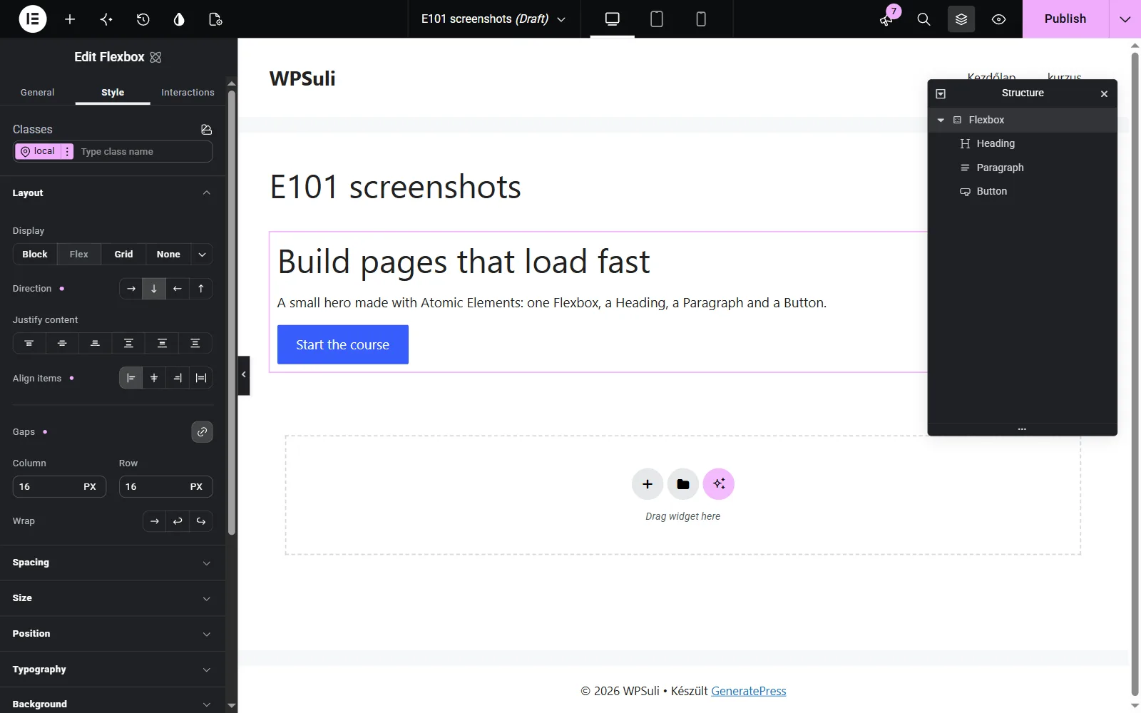
Drag a Flexbox onto the canvas and put three Buttons inside it. Then open Style › Layout:
- Direction: row (side by side, the default) or column (stacked).
- Justify content: where children sit along the direction (start, center, end, space-between).
- Align items: where they sit across it, for example vertically centred in a row.
- Gaps: the space between children, as a column and a row value that start linked. Use it instead of margins on each child.
- Wrap: allow items to move to the next line when they run out of room.
03Grid: columns that line up
When things need to line up both across and down, as in a card grid, use Grid. A new Grid starts with 3 columns, 2 rows and a 20 px gap, so a card grid is ready as soon as you drop it in.
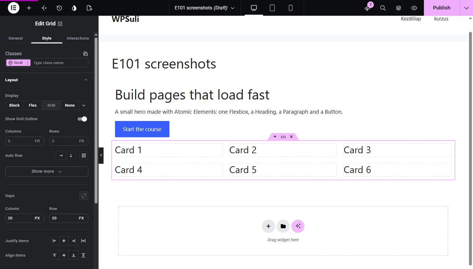
- Drag in a Grid. In Style › Layout, set Columns and Rows to the numbers you need.
- Drop a Div block in each cell for the cards, then put a Heading and Paragraph inside each card.
- Set Gaps once on the Grid. Every card gets the same spacing.
- Switch to tablet and set 2 columns, then switch to mobile and set 1. The cards reflow automatically.
04Build it: a simple hero section
Put it together. This is the structure behind most hero sections, including the ones in the Katka templates:
- Flexbox — "Hero" · row · align center · gap 48
- Flexbox — "Hero text" · column · gap 16
- Heading (h1)
- Paragraph
- Flexbox — "Buttons" · row · gap 12
- Button
- Button
- Image
- Flexbox — "Hero text" · column · gap 16
- Add the outer Flexbox. Set the direction to row, align items to center and the gap to 48 px. Give it padding of about 80 px top and bottom.
- Inside it, add a column Flexbox for the text and an Image next to it.
- Fill the text column with a Heading (set the tag to
h1), a Paragraph and a row of two Buttons. - Switch to mobile and set the outer Flexbox to column. The image drops under the text.
- Rename each layout element in Structure. In two weeks, "Hero text" will mean more to you than "Flexbox".
05Content width and spacing basics
Two habits keep layouts clean:
- Limit width on an inner box, not the page. Keep the outer box full-width (for the background), and give an inner box a Max width such as 1200 px, with automatic left and right margins to centre it.
- Padding on parents, gap between children. Avoid adding margin to every element. It's the main reason layouts drift on mobile.
06Common mistakes
- Using Flexbox for card grids. Cards with different text lengths stop lining up. Use Grid when there are both rows and columns.
- Nesting "just in case". Every extra box is one more thing to style and select. Add a wrapper only when it does a job.
- Fixed heights. A fixed height looks fine until the text gets longer or the screen gets narrower. Let content set the height, and use min-height if you need a floor.
✓Quick quiz
Three questions to check the essentials. Get them all right to complete the lesson.