Elementor 101 · Lesson 06
Styling: the Style tab, States and responsive design
One Style tab for every element, hover and focus States, and per-device values for any property.
Written for Elementor 4.3.3 · Elementor Pro 4.3.1 · Updated October 2026
01One Style tab for everything
Every Atomic Element shares the same Style tab, organised like CSS. Once you know it on a Heading, you know it on a Button, an Image and a Grid.
| Section | Controls |
|---|---|
| Layout | Display (block, flex, grid, none), direction, alignment, gap |
| Spacing | Padding and margin |
| Size | Width, height, min/max, aspect ratio, object fit, overflow |
| Position | Static, relative, absolute, sticky, z-index, anchor offset |
| Typography | Font, size, weight, line height, colour, columns |
| Background | Colour, gradient and image layers; clipping |
| Border | Width, style, colour, radius |
| Effects | Blend mode, opacity, box shadow, transform, transitions, filters, backdrop filters |
| Custom CSS | Your own CSS for this element, when no control covers it |
02Responsive: every property, every device
In version 4, any style property can have a different value per device, not just a few selected ones. Values flow downward:
- Design on desktop.
- Switch to tablet, then mobile, and fix only what breaks: usually font sizes, flex direction, grid columns and padding.
- A dot next to a control's label shows that it has a value on the current device. Use reset to go back to inheriting.
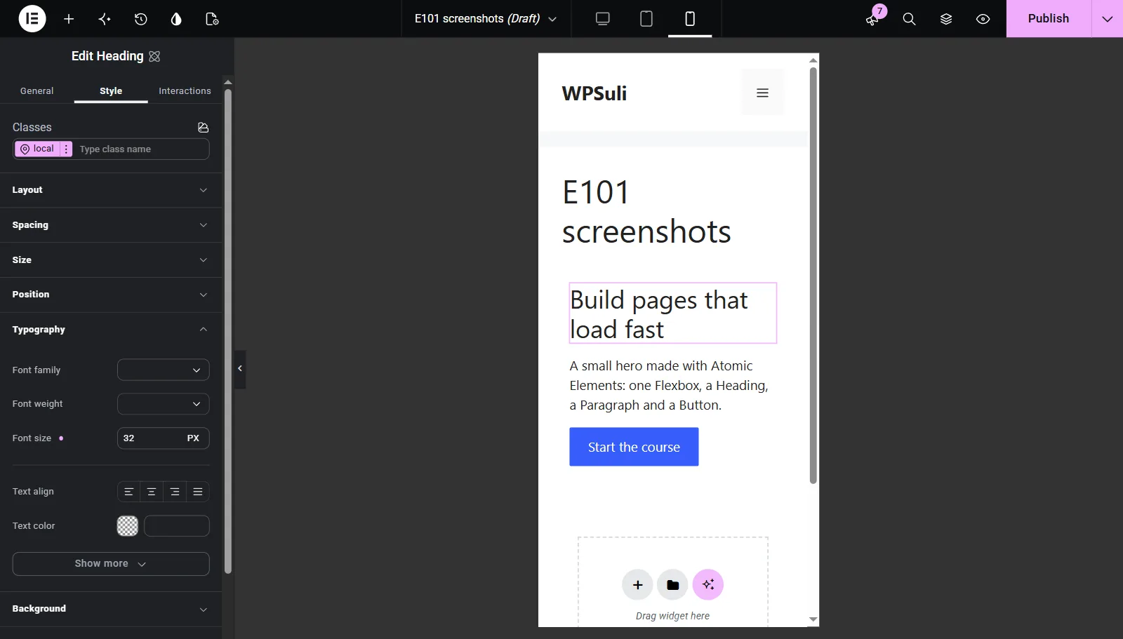
03States: hover, focus and active
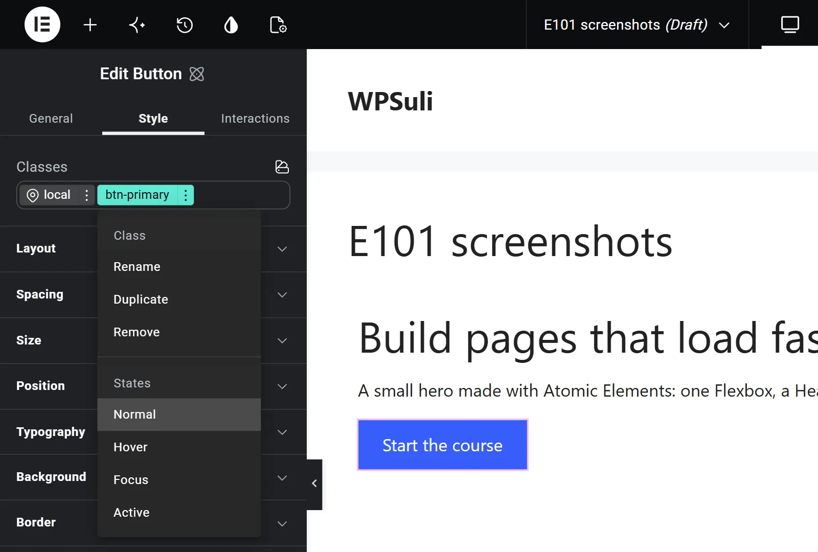
States let you style how an element looks while a visitor interacts with it. At the top of the Style tab, open the ⋮ menu on a class chip in Classes, pick a state under States, then change any property:
- normal: the default look.
- hover: the mouse is over it.
- focus: it's selected with the keyboard. Always give buttons and links a visible focus style.
- active: it's being clicked.
Add an item under Transitions in Effects so state changes animate smoothly (150–250 ms feels responsive). States belong to Classes, which makes them reusable. More on that in the next lesson.
04Local styles and where values come from
When you style an element directly, Elementor stores it in that element's Local class. It's unique to the element and wins over everything else, which is fine for one-off tweaks.
Colour-coded indicators next to each control tell you where a value comes from: set here, inherited from a Class, or inherited from a base style. When something "won't change", the indicator shows you which layer to edit.
05Effects without the bloat
Shadows, filters, transforms and blend modes are all built in, so you don't need an addon plugin for "hover lift" cards:
- On a card, add a subtle Box shadow.
- Switch to the hover state and add a Transform → move Y by −4 px with a slightly stronger shadow.
- Under Transitions, add an item of 200 ms.
Those three steps cover most "interactive card" effects you see on modern sites.
06Common mistakes
- Styling everything locally. It works until the client wants every button rounder. Move repeated styles into Classes.
- No focus state. Keyboard users can't see where they are. It's an accessibility failure, and it's easy to fix.
- Designing mobile last, in a hurry. Most visitors are on phones. Check every section on mobile as you build it.
✓Quick quiz
Three questions to check the essentials. Get them all right to complete the lesson.