Elementor 101 · Lesson 07
Build a design system with Variables and Classes
Colour, font and size Variables, reusable Classes, the Design System panel and Default Styles.
Written for Elementor 4.3.3 · Elementor Pro 4.3.1 · Updated October 2026
01Why a design system pays off
A design system is a short list of decisions you make once: brand colours, fonts, sizes, and what a button or a card looks like. Elementor 4 gives you two tools for it:
- Variables are single values with a name:
brand-rose= #ed3d6b,space-l= 48 px. - Classes are bundles of styles with a name, such as
btn-primaryorcard. Classes can use Variables.
Change the variable and every Class and element that uses it updates across the whole site. That's how a rebrand takes ten minutes instead of a weekend.
02Create your Variables
Click Design System in the top bar. The panel has three tabs: Defaults, Variables and Classes. On the Variables tab, add a variable, pick its type (Color, Font or Size), give it a name and a value, then click Save changes.
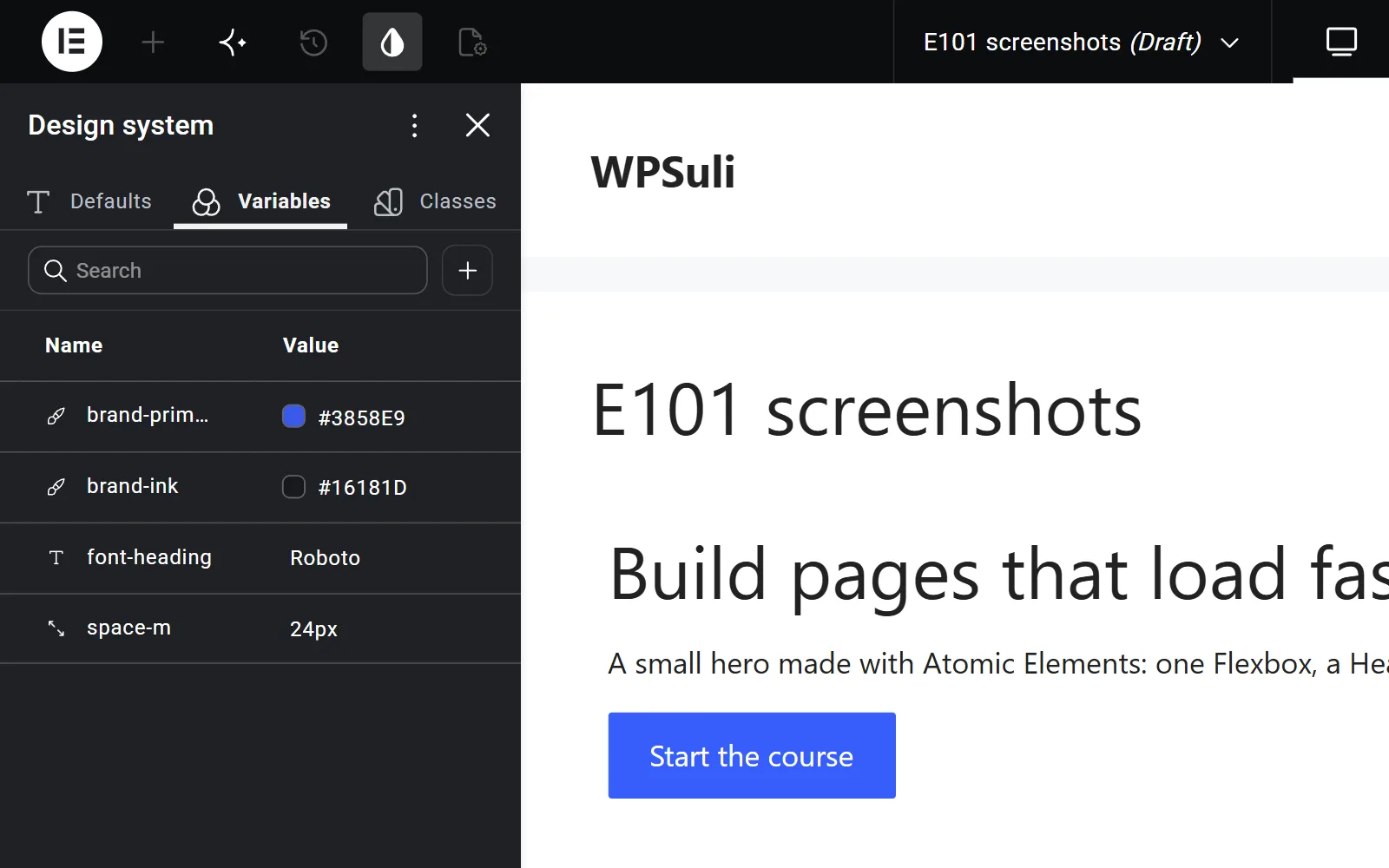
Start small:
| Type | Start with | Example names |
|---|---|---|
| Colour | 2 brand colours, text, muted text, background, border | brand, accent, text, text-muted, surface, line |
| Font | A heading font and a body font | font-display, font-body |
| Size | A spacing scale and a few font sizes | space-s 12, space-m 24, space-l 48, text-xl 48 |
03Create and apply Classes
- Select a Button and style it with your Variables: background
brand, paddingspace-s/space-m, plus a radius. - In the Type class name field at the top of the Style tab, type
btn-primaryand create it. The styles now live in the Class instead of the Local class. - Add a hover state to the Class, as in lesson 06.
- On every other primary button, just add
btn-primary. Done.
An element can have several Classes, for example card plus card--featured. The Class Manager lets you rename, reorder, find where a Class is used, and delete unused ones.
04Default Styles for plain HTML tags
Default Styles (new in 4.3) set the base look of supported HTML tags across the site, such as headings, paragraphs and links. You'll find them on the Defaults tab of the Design System panel. Set your heading font, body font and link colour here once. You then need fewer Classes, because a plain h2 already looks right.
05Keep classic widgets in sync
Classic widgets use the older Global Colors and Global Fonts in Site Settings. Version 4 can sync colour Variables and typography Classes to them, so a classic Testimonial widget and an Atomic Heading share the same brand colours and fonts.
Turn on syncing for the Variables and Classes your classic widgets need. Then edit them in the Design System panel, not in Site Settings.
06Common mistakes
- Forty colour Variables. If you can't remember when to use a colour, it shouldn't be a variable. Keep it to around 6–10.
- Overriding Classes locally. One local tweak is fine. Twenty of them means you need a modifier Class such as
btn-primary--large. - Naming Classes after a page.
home-hero-buttoncan't be reused anywhere else. Name Classes by what they are.
✓Quick quiz
Three questions to check the essentials. Get them all right to complete the lesson.